Header & Navigation
Essential steps to customizing the header section and navigation menus of your site.
Menu Locations
The theme comes with multiple menu locations. Some of this menus are only visible when they are enabled from the Theme Options -> Header -> Navigation.
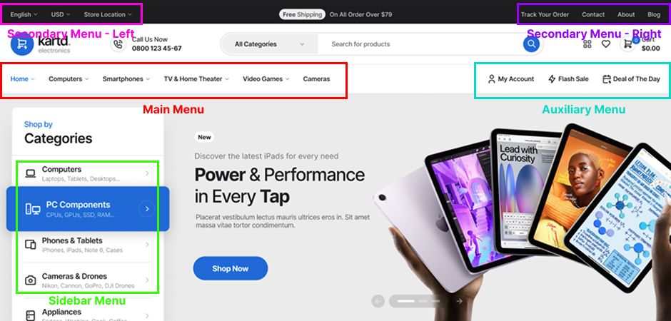
The bellow image shows all header menu locations and also the sidebar menu location. The navbar layout is set to Expanded (double), and the rest of the content in the navbar is enabled from the theme options - header > navigation and shortcodes.
In order some menu location to appear you need to have the theme bundled plugins installed: Ajdethemes Framework and Ajdethemes Elementor Addons and also specific theme option settings enabled (usually located in the header subsection).
Menu Item - Icons
The theme supports optional menu item icons, they can be added when editing a menu item from Dashboard > Appearance > Menus > Select Menu - (menu item dropdown arrow > icon input). You can use any icon code from any icon font that is loaded on your site.
Mega Menus
The mega menu are essential feature for electronics store, because of that the theme have mega menus build in that use templates to build & edited them via Elementor.
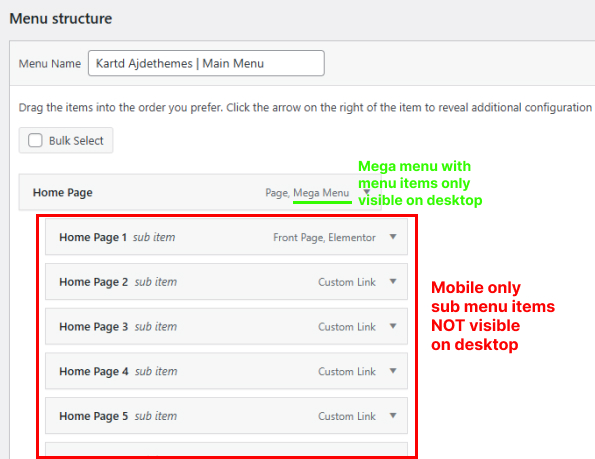
The theme support two locations for mega menus: Main Menu and Sidebar Menu.
Mega menus are only visible on desktop screen sizes. The regular nested sub menu items added via the default WordPress menu editor won't be visible in the mega menus - they are only visible on the mobile menus, because there is no mega menu on mobile screen sizes.
Steps to Create a Mega Menu
- 1Head to Appearance -> Mega Menus -> Add New Mega Menu. Then create your mega menu.
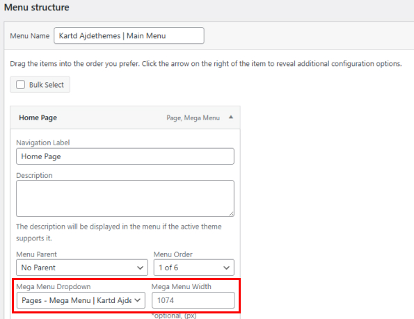
- 2When you have mega menu created you can select in Appearance -> Menus -> Menu Item(top level) -> Mega Menu Dropdown.
- 3Set custom width to the mega menu in Appearance -> Menus -> Menu Item ->Mega Menu Width if you don't want to span the full width of the navbar.
Mobile Menu
Mobile menu can be customized from the Theme Options -> Colors -> Navbar Mobile Colors.
Note that mega menus are only visible on the desktop screen sizes, including their menu items created via Elementor. Menu items with mega menus - that have nested sub menu items, are only visible on mobile screens (the sub menus), the mega menus are not visible on mobile screens.